Through November 28, 2010
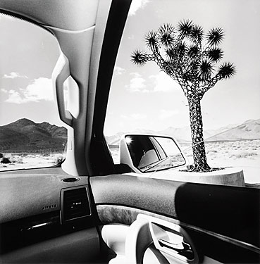
The 192 photographs on display at the Whitney represent a visual narration of Lee Friedlander's travels across America over the last 15 years. At first, the images captured from the artist's rented car are so familiar to the viewer that he/she can't help but wonder whether they are worthy of any artistic value being attributed to them. I suspect the sentiment is underscored by many a viewer's cynical take on what gets passed off as "art" today and a somewhat enduring, albeit old-fashioned, belief that the medium of photography is inferior to painting or sculpture due to its accessibility to the non-artist layman.
While the content matter is, in my opinion, hardly new or exceptional (Americana all over again- Coca Cola signs, Joshua trees, billboards, the car itself...), the composition and lighting of the photos in no way resemble the arbitrariness of casual snapshots. Upon closer inspection, it's clear that a lot of thought went into the way in which the structures of the car (both inside and out) frame the landscape and its constituent objects, at times not merely capturing it but actually redefining it. The elements of the car become architectural structures within certain photographs- solid and stoical, embodying linear or curvilinear lines of some definite and purposeful design, magistral.... Likewise, the juxtaposition of different textures and intensities of light is thoughtful, subtle and highly effective in creating two clearly distinct worlds: the inside of the car and the world outside it.
Meanwhile, the curating of the exhibition, which was done in accordance with the artist's specific instructions, is spot on. The photographs are densely hung across the six walls of two small adjacent rooms in order to re-create the sensory overload associated with traveling in a car in America. And it works- the viewer feels overwhelmed by the vast number of images surrounding him in the tight, cramped space and, just like a car passenger, tries to take it all in as best he/she can. This way of displaying photographs reminded me of Julian Schnabel's curating of Dennis Hopper's retrospective at MOCA in Los Angeles last month except because the space was far smaller at the Whitney, the effect was quite different (as was the view of the photos- much better- given the size of the walls).
Definitely a worthwile trip to the Whitney though probably best combined with another exibit/ purpose for the visit as it doesn't take long to view the two rooms.

No comments:
Post a Comment